Statistical modeling is one of the most powerful tools in data science. We use models for two primary purposes: to explore relationships between variables and to make predictions. Sometimes we are interested in understanding causal relationships (Does oil wealth impact regime type?), while other times we focus on predictive accuracy (Is this policy associated with better outcomes?).
In this module, we will explore linear regression, one of the foundational techniques in statistical modeling. We will learn how to quantify relationships between variables using correlation, fit linear models to data, and interpret the results. Throughout, we will work with real data examining the relationship between a country’s wealth and its level of democracy.
Understanding Relationships Between Variables
When we build statistical models, we need to distinguish between different types of variables. The response variable (also called the dependent variable, outcome variable, or Y variable) is what we are trying to understand or predict. The explanatory variables (also called independent variables, predictors, or X variables) are what we use to explain variation in the response.
For example, if we want to understand what factors influence a country’s level of democracy, democracy is our response variable. A potential explanatory variable is GDP per capita — countries with more wealth might have stronger democratic institutions.
Let’s load some data to explore this relationship:
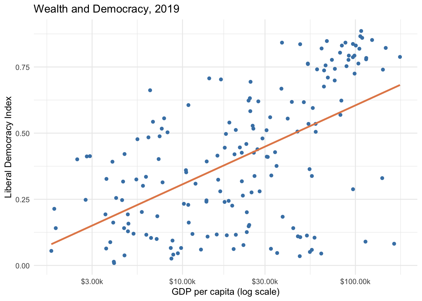
Here we have data on liberal democracy, GDP per capita, and political polarization for 2019. Let’s visualize the relationship between wealth and democracy. We use scale_x_log10() to show wealth on a log scale since GDP per capita spans several orders of magnitude:
ggplot(model_data, aes(x =wealth, y =lib_dem))+geom_point(color ="steelblue")+geom_smooth(method ="lm", color ="#E48957", se =FALSE)+scale_x_log10(labels =scales::label_dollar(suffix ="k"))+labs( title ="Wealth and Democracy, 2019", x ="GDP per capita (log scale)", y ="Liberal Democracy Index")+theme_minimal()
Important
Here we use scale_x_log10() to transform the x-axis to a logarithmic scale. This is often useful when dealing with variables that span several orders of magnitude. Later, when we fit the model, we will apply the same transformation using log_wealth (the natural log of GDP per capita) as our predictor.
There is a clear positive relationship: wealthier countries tend to be more democratic. Notice the cluster of outliers in the lower right — wealthy but undemocratic states, many of them oil-rich authoritarian countries like Saudi Arabia and the UAE.
Correlation
Before fitting a formal model, we can quantify the strength of the linear relationship using a correlation coefficient. The correlation coefficient (r) measures the strength and direction of a linear relationship, ranging from -1 to +1:
A correlation of about 0.53 indicates a moderate positive linear relationship between log GDP per capita and democracy. The relationship would likely be stronger if not for those oil-state outliers.
Your Turn
Calculate the correlation between democracy (lib_dem) and polarization. How does it compare to the correlation with log wealth? Is it positive or negative, and does the direction make sense substantively?
Linear Model with Single Predictor
We can represent the relationship between variables using a mathematical function. A linear model with one explanatory variable takes the form:
\[Y = a + bX\]
Where \(Y\) is the response variable, \(X\) is the explanatory variable, \(a\) is the intercept (predicted value of Y when X = 0), and \(b\) is the slope (change in Y for a one-unit change in X). Our goal is to estimate:
\[\widehat{lib\_dem}_{i} = a + b \times log\_wealth_{i}\]
In R, we use the lm() function. The ~ symbol is read as “is modeled by”:
democracy_model<-lm(lib_dem~log_wealth, data =model_data)summary(democracy_model)
Call:
lm(formula = lib_dem ~ log_wealth, data = model_data)

Residuals:
     Min       1Q   Median       3Q      Max
-0.58981 -0.14940  0.04111  0.18360  0.41129

Coefficients:
            Estimate Std. Error t value Pr(>|t|)
(Intercept) 0.008248   0.047553   0.173    0.862
log_wealth  0.129576   0.014481   8.948 5.66e-16 ***
---
Signif. codes:  0 '***' 0.001 '**' 0.01 '*' 0.05 '.' 0.1 ' ' 1

Residual standard error: 0.2171 on 172 degrees of freedom
Multiple R-squared:  0.3176,    Adjusted R-squared:  0.3137
F-statistic: 80.07 on 1 and 172 DF,  p-value: 5.657e-16
Intercept (0.13): The predicted democracy level when log(wealth) = 0. Since log(wealth) = 0 when GDP per capita = $1, this is a theoretical baseline.
Slope (0.12): For every one-unit increase in log GDP per capita, democracy is predicted to increase by 0.12 points. The p-value is far below 0.05, so we reject the null hypothesis that the slope is zero.
When we use logarithmic transformations, thinking in terms of multiplications (rather than additions) is more intuitive:
Doubling GDP per capita (e.g., $10k → $20k) increases the predicted democracy score by \(0.12 \times \ln(2) \approx 0.083\) points
Tripling GDP per capita (e.g., $10k → $30k) increases it by \(0.12 \times \ln(3) \approx 0.132\) points
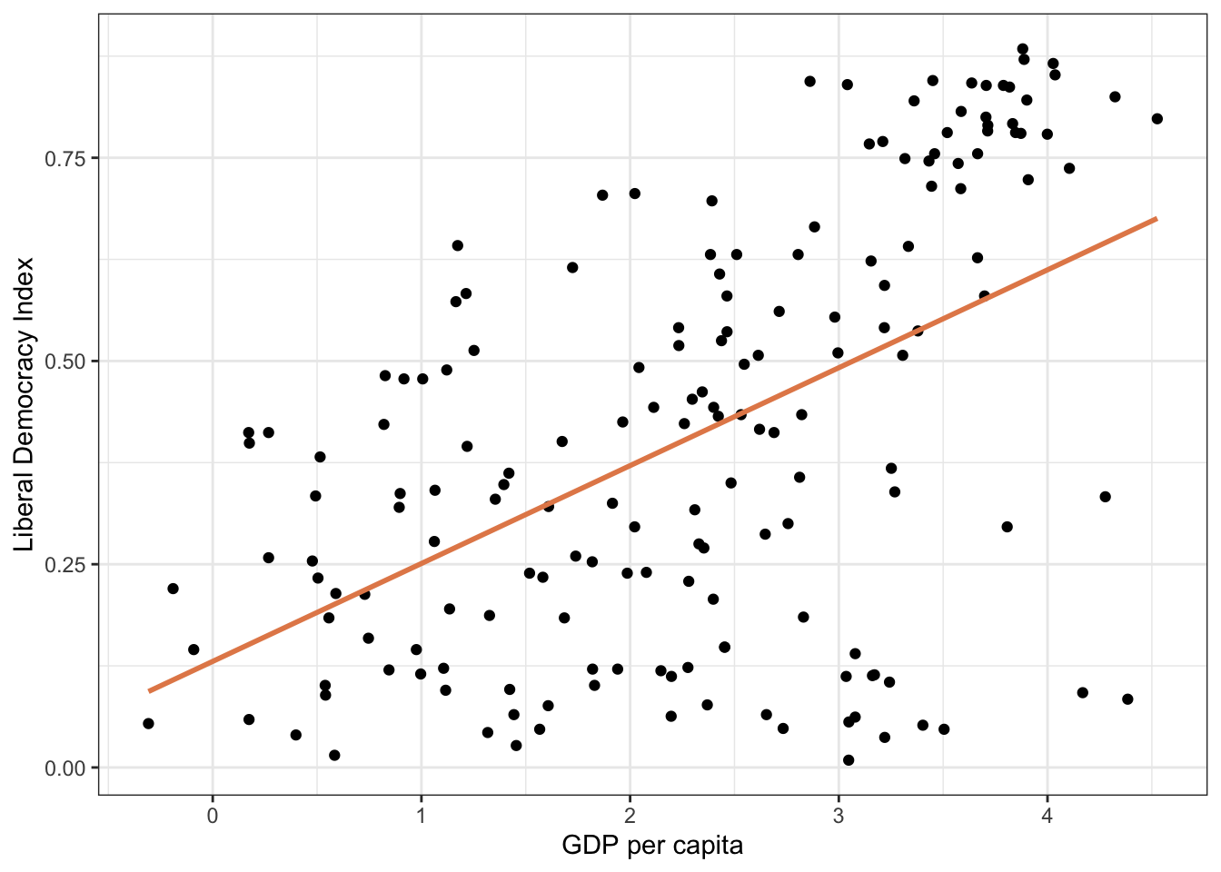
Let’s visualize the fitted line:
ggplot(model_data, aes(x =log_wealth, y =lib_dem))+geom_point()+geom_smooth(method ="lm", color ="#E48957", se =FALSE)+labs( title ="GDP per Capita and Democracy, 2019", x ="Log GDP per capita", y ="Liberal Democracy Index")+theme_minimal()
Your Turn
Use the model equation to predict democracy for a country with log wealth = 2 (roughly $7,000 GDP per capita) and one with log wealth = 4 (roughly $55,000 per capita). The formula is \(\hat{Y} = 0.13 + 0.12 \times log\_wealth\).
Try regressing democracy on polarization (not log-transformed). Interpret the slope coefficient.
Predicted Values and Residuals
Every model produces predicted values (\(\hat{Y}\)) — the model’s expected output for each observation given its inputs. Residuals measure how far each observation falls from its predicted value:
\[e_i = y_i - \hat{y}_i\]
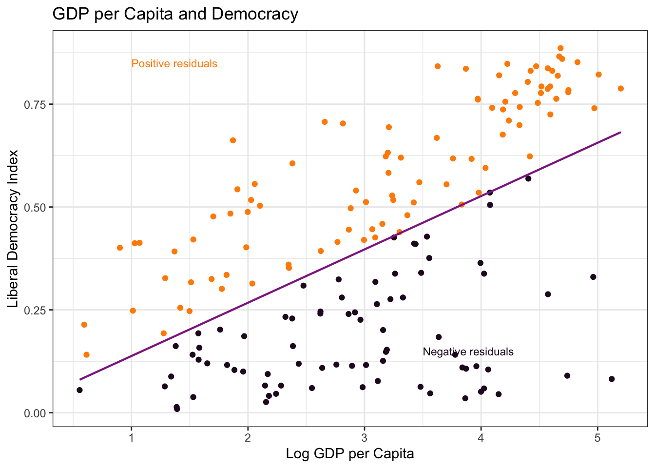
We can visualize positive and negative residuals by color-coding points above and below the regression line:
Countries above the line (orange) have positive residuals — more democratic than their wealth would predict. Countries below the line (dark) have negative residuals — less democratic than predicted.
How well does the model fit? R-squared tells us what proportion of variation in democracy is explained by the model:
An R-squared of approximately 0.28 means about 28% of the variation in democracy scores is explained by log GDP per capita. The remaining 72% reflects other factors — political history, institutions, natural resource endowments, and more.
How is the “Best” Line Drawn?
How does R find the optimal intercept and slope? It solves an optimization problem: find the line that minimizes the sum of squared residuals (SSR):
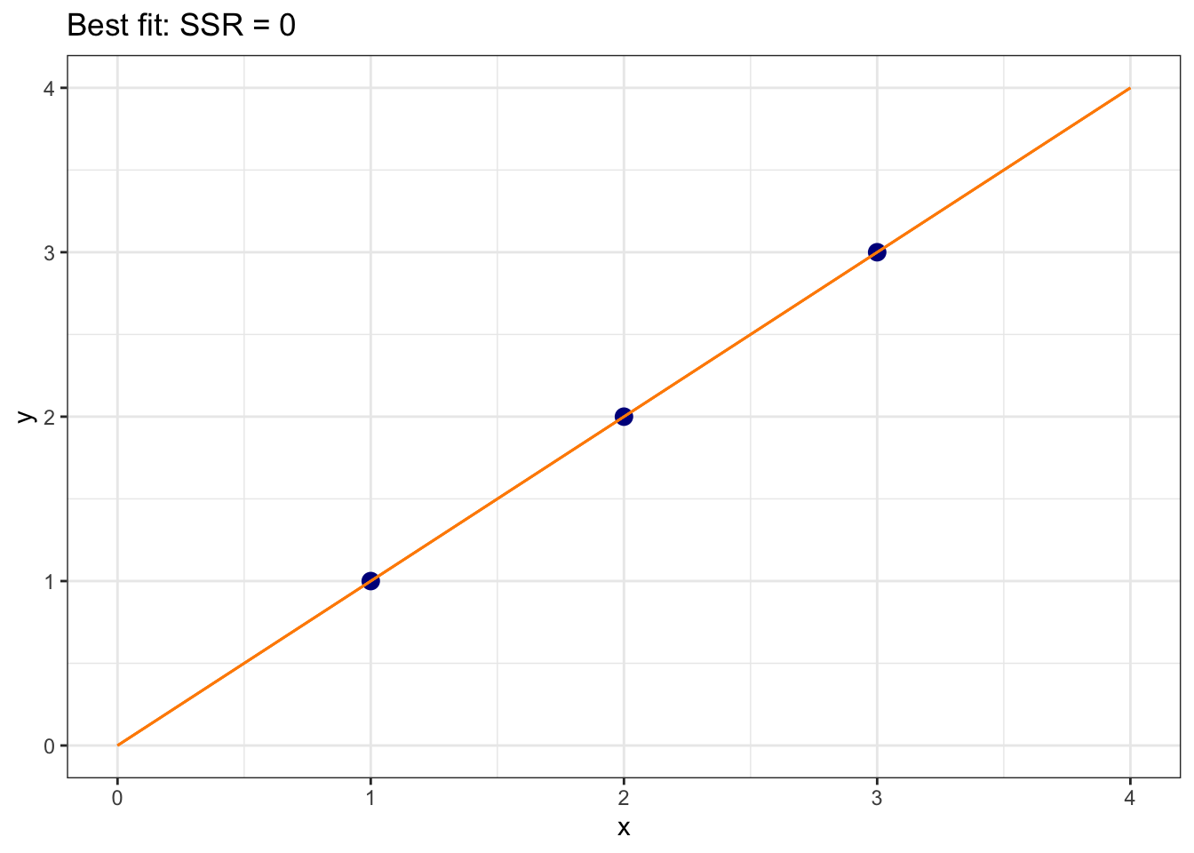
Let’s build intuition with a simple three-point example: (1,1), (2,2), (3,3). The line \(\hat{y} = 0 + 1 \times x\) passes exactly through all three points, giving SSR = 0:
dat<-tibble(x =c(1, 2, 3), y =c(1, 2, 3))ggplot(dat, aes(y =y, x =x))+geom_point(size =3, color ="darkblue")+xlim(0, 4)+ylim(0, 4)+geom_segment(x =0, y =0, xend =4, yend =4, color ="darkorange")+labs(title ="Best fit: SSR = 0")+theme_bw()
What about a steeper line, \(\hat{y} = 0 + 2 \times x\)?
(1-2)^2+(2-4)^2+(3-6)^2
[1] 14
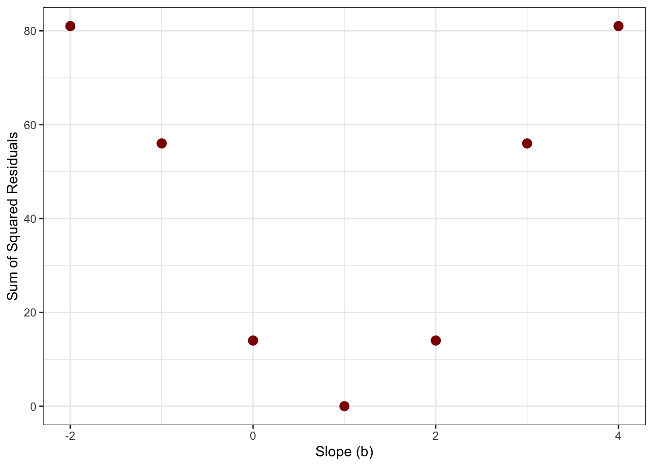
SSR = 14 — much worse. We can plot the SSR for each possible slope value and see that the cost function is minimized at \(b = 1\):
sse<-tibble( b =c(-2, -1, 0, 1, 2, 3, 4), c =c(81, 56, 14, 0, 14, 56, 81))ggplot(sse, aes(y =c, x =b))+geom_point(size =3, color ="darkred")+geom_line(color ="darkred")+labs( title ="Cost function: SSR as a function of slope", x ="Slope (b)", y ="Sum of Squared Residuals")+theme_bw()
The parabola reaches its minimum at \(b = 1\) — exactly where SSR = 0. This is the “least squares” in least squares regression: find the line that minimizes the total squared error across all data points.
Use the interactive app below to explore this further. Move the slider to choose a different slope and watch how the regression line (left) and your position on the cost function curve (right) change together:
Our model shows a strong association between wealth and democracy, but this does not prove that wealth causes democracy. Several explanations are possible:
Wealth → Democracy: Economic development may create conditions supporting democratic institutions
Democracy → Wealth: Democratic institutions may promote economic growth
Third variable: Other factors (education, geography, culture) may influence both wealth and democracy
Reverse causation: The relationship may work in both directions simultaneously
Establishing causation requires more sophisticated methods — natural experiments, instrumental variables, or randomized controlled trials — beyond the scope of this course.