Install the ggridges package: install.packages("ggridges")
Copy and run the setup chunk below in your Quarto notebook.
Code
library(tidyverse)library(vdemdata)vdem2022<-vdem|>filter(year==2022)|>select( country =country_name, polyarchy =v2x_polyarchy, women_empowerment =v2x_gender, polarization =v2cacamps, regime =v2x_regime, region =e_regionpol_6C)|>mutate( region =case_match(region,1~"Eastern Europe",2~"Latin America",3~"Middle East",4~"Africa",5~"The West",6~"Asia"), regime =case_match(regime,0~"Closed Autocracy",1~"Electoral Autocracy",2~"Electoral Democracy",3~"Liberal Democracy"))
Overview
In this module we turn from categorical to continuous variables — measurements that can take on any value within a range, like GDP per capita, a democracy score, or political polarization. We learn how to visualize distributions with histograms and density plots, how to describe the shape of a distribution, and how to summarize its center and spread with statistics. We end with a step-by-step walkthrough of how standard deviation is actually calculated.
Distribution Shapes
When we first encounter a continuous variable, we want to know what its distribution looks like — where values cluster, where they tail off, and whether there are multiple peaks. Recognizing common distribution shapes helps us choose the right summary statistics and spot potential issues with our data.
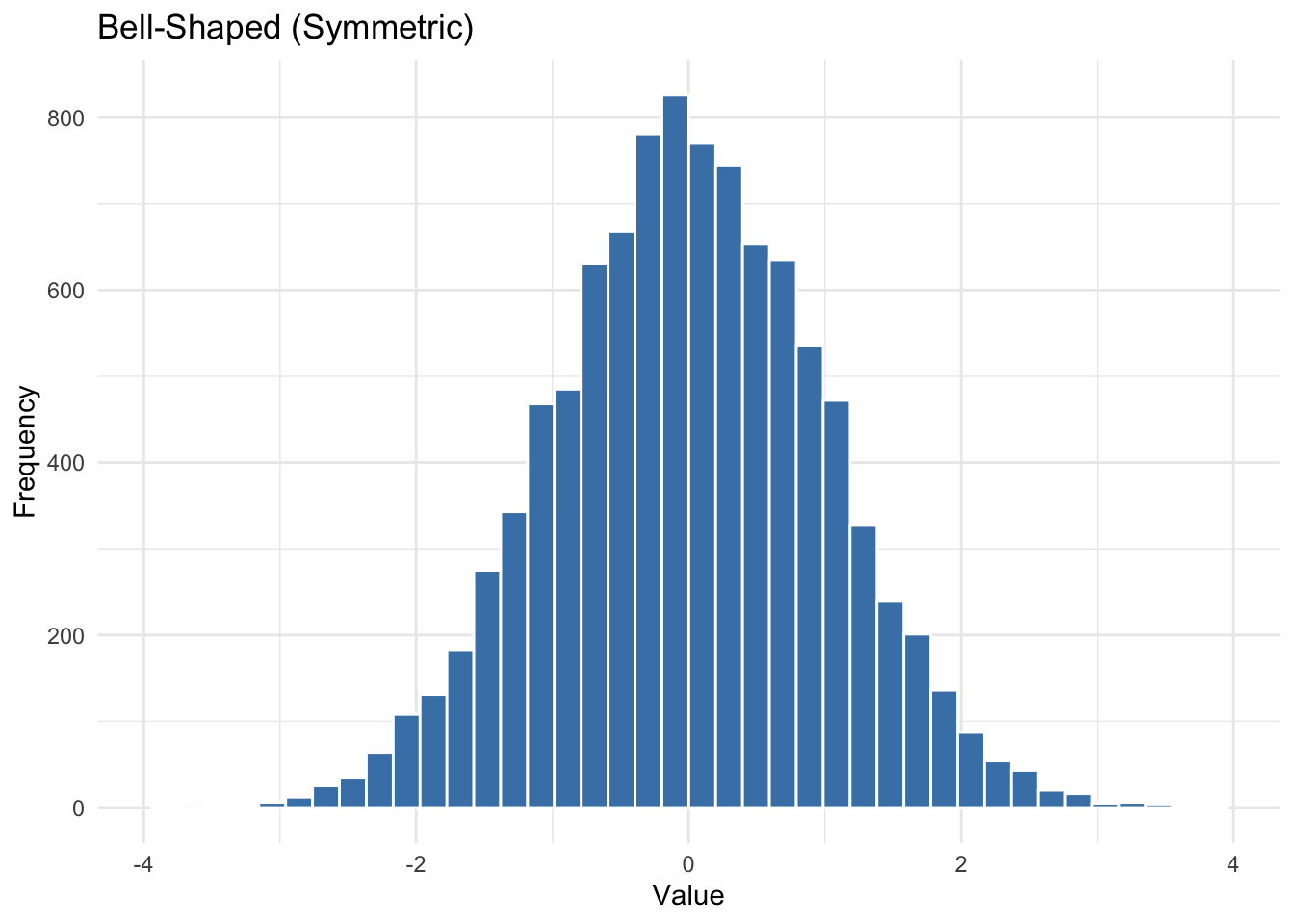
Bell-Shaped (Symmetric)
When values cluster around the center with tails tapering off evenly on both sides, we call the distribution symmetric or bell-shaped. This is the basis for many statistical methods that assume normality.
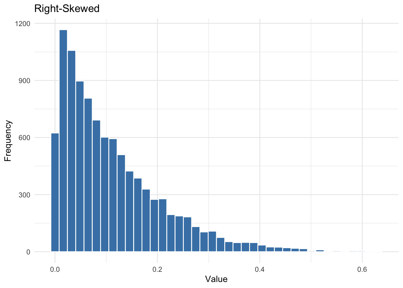
Right-Skewed
A right-skewed distribution has a long tail stretching to the right. This is common when values are bounded at zero but can extend very far upward — GDP per capita is a classic example.
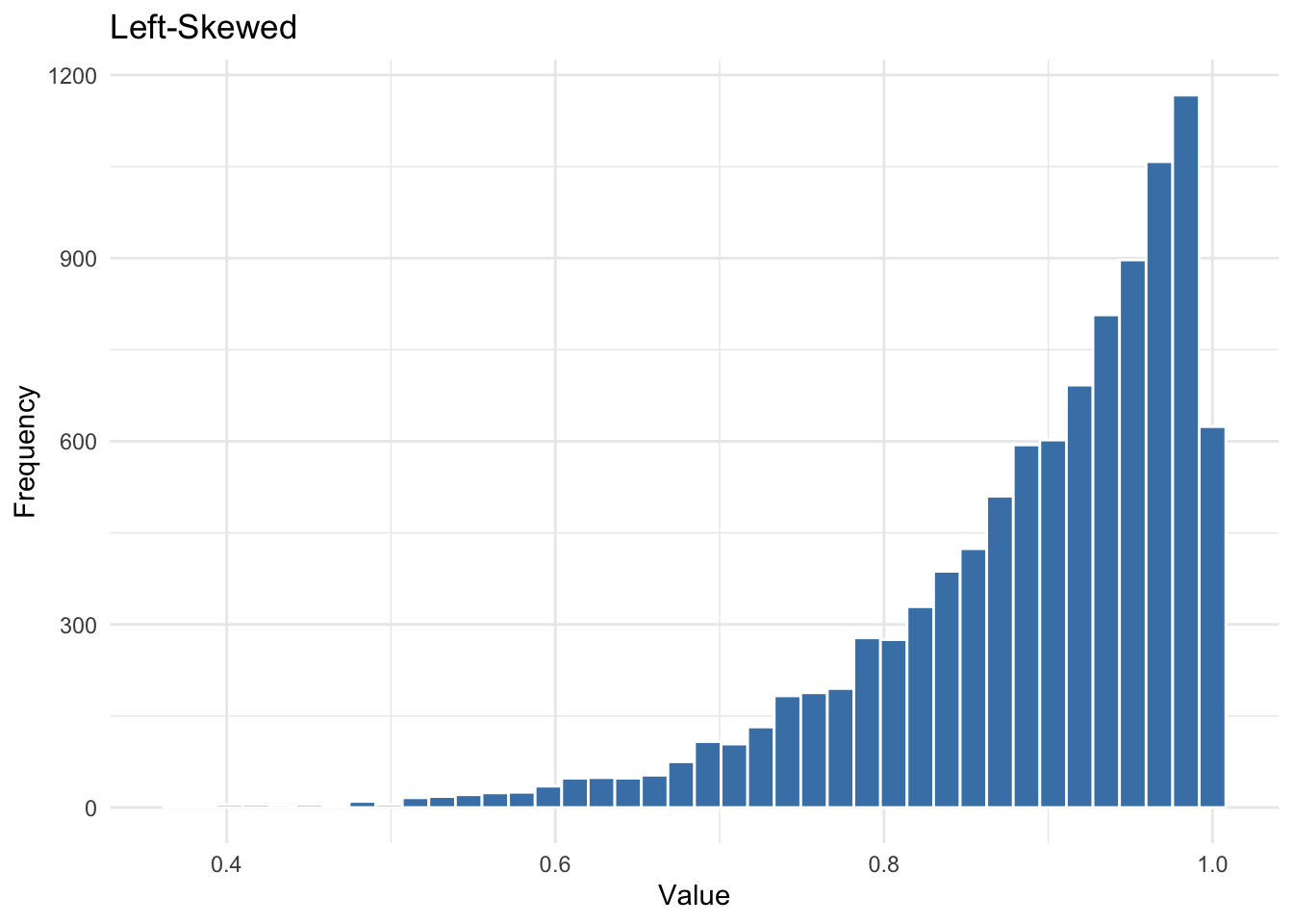
Left-Skewed
A left-skewed distribution has a long tail to the left. This can occur with variables that have an upper bound, like survey scales where most respondents score near the top.
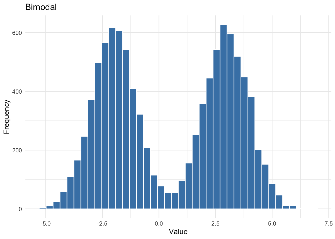
Bimodal
A bimodal distribution has two peaks. This often signals that the data come from two distinct subpopulations — for example, combining democracy scores from consolidated democracies and entrenched autocracies might produce two humps.
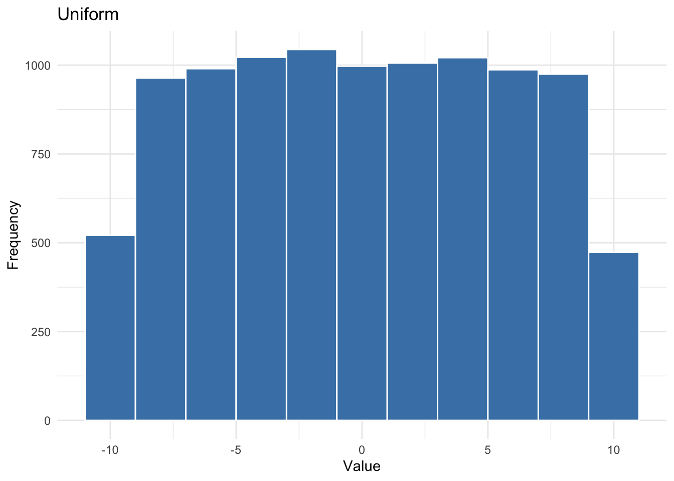
Uniform
A uniform distribution has no peaks — all values are roughly equally likely. This is rare in real data but useful to recognize.
Each shape tells a different story about the data — and as we will see below, shape affects which summary statistics are most reliable.
Histograms and Density Plots
Histograms
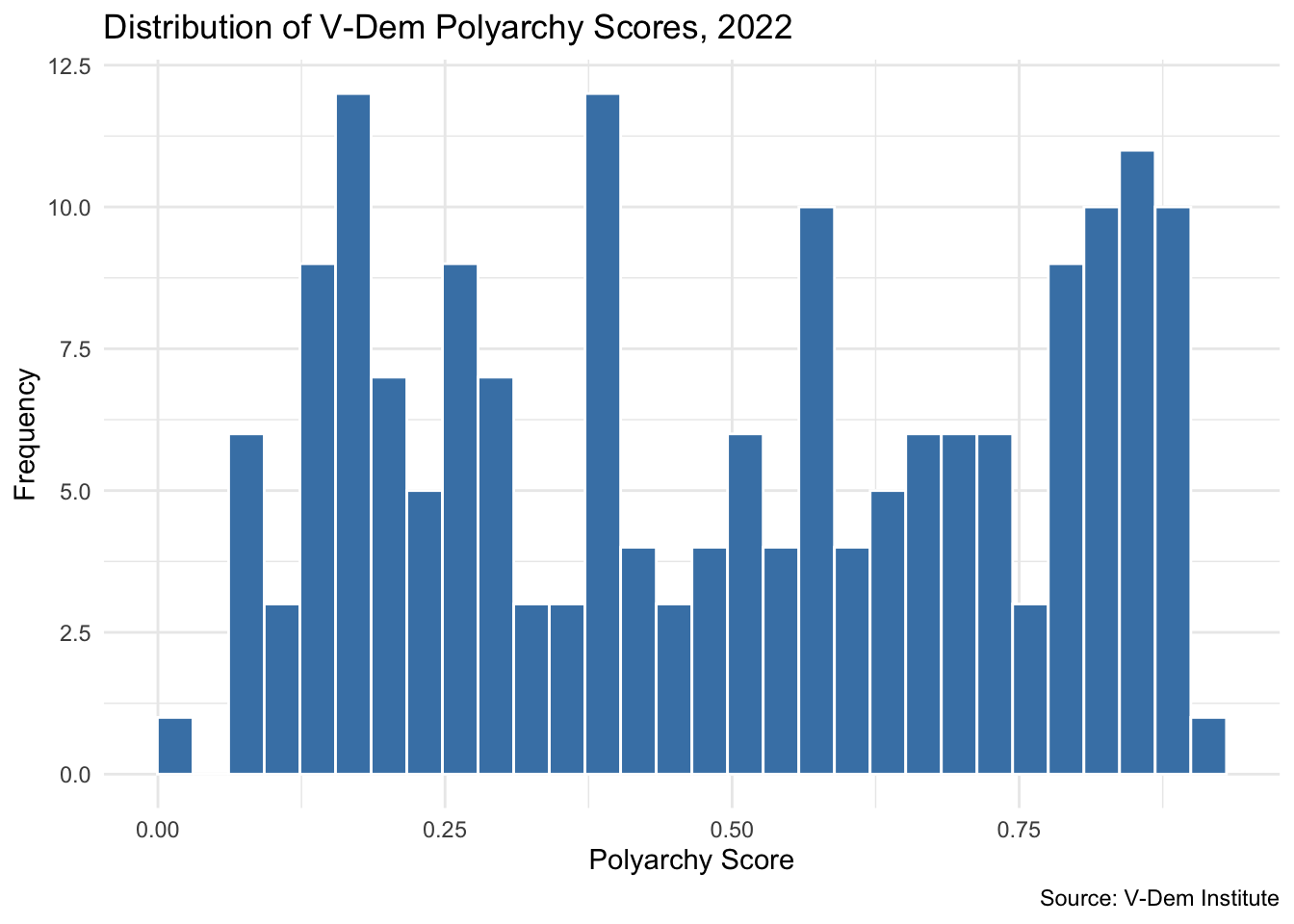
A histogram groups values into bins and counts how many observations fall into each one. In ggplot2 we use geom_histogram() and only need to specify the x aesthetic — the counts are computed automatically.
ggplot(vdem2022, aes(x =polyarchy))+geom_histogram(bins =30, fill ="steelblue", color ="white")+theme_minimal()+labs( title ="Distribution of V-Dem Polyarchy Scores, 2022", x ="Polyarchy Score", y ="Frequency", caption ="Source: V-Dem Institute")
The polyarchy distribution looks non-normal — there appear to be multiple peaks, with clusters of countries at both low and high ends.
Density Plots
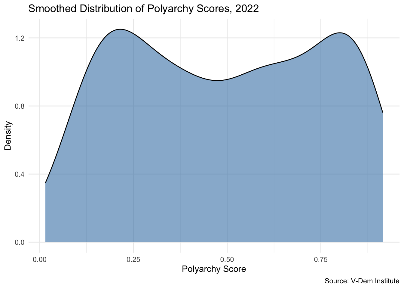
A density plot uses a smoothed curve to estimate the shape of a distribution. It is similar in spirit to a histogram but avoids the distortion that comes from choosing a bin width. Use geom_density():
ggplot(vdem2022, aes(x =polyarchy))+geom_density(fill ="steelblue", alpha =0.6)+theme_minimal()+labs( title ="Smoothed Distribution of Polyarchy Scores, 2022", x ="Polyarchy Score", y ="Density", caption ="Source: V-Dem Institute")
The density plot confirms the bimodal pattern: one cluster of countries with low polyarchy scores and another with high scores. This suggests the world in 2022 was polarized between autocracies and democracies, with relatively few countries in the middle.
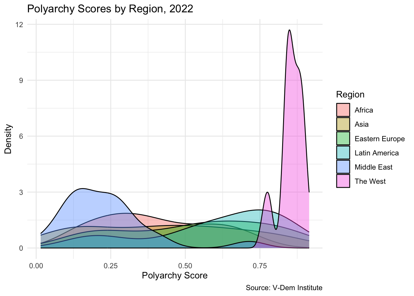
Density plots also make it easy to compare groups. We add a fill aesthetic to overlay distributions by region:
ggplot(vdem2022, aes(x =polyarchy, fill =region))+geom_density(alpha =0.4)+theme_minimal()+labs( title ="Polyarchy Scores by Region, 2022", x ="Polyarchy Score", y ="Density", fill ="Region", caption ="Source: V-Dem Institute")
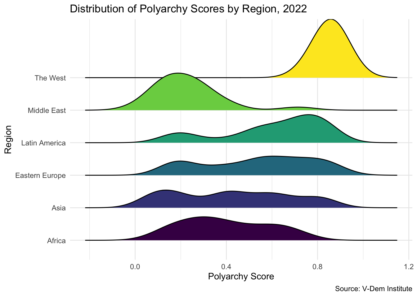
For cleaner comparisons across groups, a ridge plot stacks density curves vertically. Load the ggridges package and use geom_density_ridges():
Each region has a distinct distribution: the West is left-skewed (most countries are highly democratic); the Middle East and Africa are right-skewed; Latin America and Eastern Europe are roughly symmetric; Asia appears bimodal.
Your Turn
Create a histogram of the women_empowerment variable. Adjust bins to see how it changes the visualization.
Create a density plot of women_empowerment. Does it make the shape clearer than the histogram?
Add fill = region to the density plot. What patterns emerge across regions?
Repeat with polarization. How does its distribution compare?
Measures of Central Tendency
When we describe the center of a distribution, we use measures of central tendency — typically the mean and the median.
The mean is the arithmetic average.
The median is the middle value: half the observations fall below, half above.
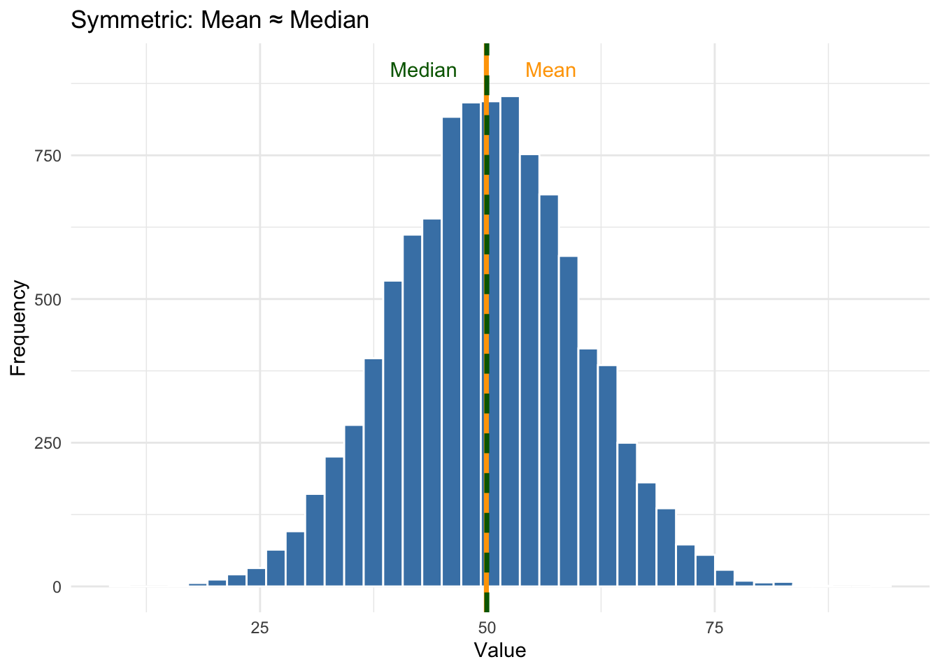
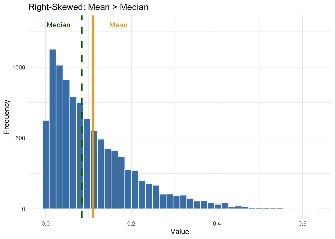
In a symmetric distribution the mean and median are nearly identical. But in a skewed distribution the mean gets pulled toward the long tail while the median stays closer to the bulk of the data. This is why skewed distributions make the mean misleading — the median is often the more honest measure.
The plots below illustrate this. The orange line is the mean, the green dashed line is the median:
The lesson: always look at the distribution before interpreting summary statistics. When skewness is present, ask whether the reported mean is being pulled by extreme values — and if so, whether the median tells a more representative story.
Your Turn
Calculate the mean and median of women_empowerment and polarization.
For each variable, overlay both statistics on a density plot using geom_vline().
Are the mean and median close together or far apart? What does that tell you about the shape of each distribution?
Measures of Spread
Knowing the center of a distribution is not enough. Two distributions can have the same mean but look completely different — one tightly clustered, the other spread out across a wide range. Measures of spread tell us how much variability there is.
Range
The simplest measure is the range — the distance from minimum to maximum:
The range is easy to compute but sensitive to outliers — a single extreme value can make a tightly clustered distribution look spread out.
Interquartile Range (IQR)
The IQR measures the spread of the middle 50% of the data — from the 25th percentile (Q1) to the 75th percentile (Q3). It ignores the extremes and is more robust than the range:
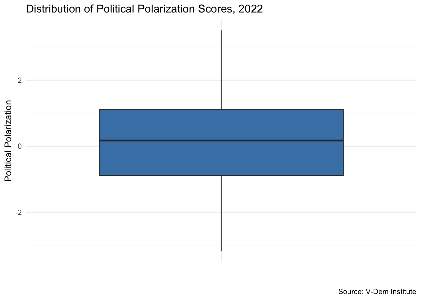
A box plot visualizes the IQR and the five-number summary (min, Q1, median, Q3, max) in one compact display. Values beyond 1.5 × IQR from the box are flagged as potential outliers:
ggplot(vdem2022, aes(x ="", y =polarization))+geom_boxplot(fill ="steelblue")+labs( x ="", y ="Political Polarization", title ="Distribution of Political Polarization Scores, 2022", caption ="Source: V-Dem Institute")+theme_minimal()
Standard Deviation
The standard deviation is the most widely used measure of spread. It tells us, on average, how far each observation lies from the mean. A small standard deviation means values cluster tightly; a large one means they are spread out.
Standard deviation is derived from the variance, which is the average squared deviation from the mean. Standard deviation is just the square root of variance — bringing the result back to the original units.
Step-by-Step: How Standard Deviation is Calculated
Let’s walk through the formula by hand using a small vector.
Important
Play the interactive code chunks below to see how each step works. You can also change the numbers in the initial vector to see how the standard deviation changes with different data.
Step 1. Create a simple vector and calculate deviations from the mean (\(e_i = X_i - \bar{X}\)):
#| label: sd-step1

x <- c(0, 1, 2, 3, 4, 5, 6, 7, 8, 9, 10)
e <- x - mean(x)
e
Step 2. Square each deviation (\(e_i^2\)) to remove negative signs:
#| label: sd-step2

e_squared <- e^2
e_squared
Step 3. Sum the squared deviations — this is the sum of squares:
The results match. Understanding this formula helps you interpret standard deviation intuitively: it is roughly the average distance of each observation from the mean.
Your Turn
Calculate range, IQR, and standard deviation for women_empowerment.
Create a box plot for women_empowerment. Are there any potential outliers?
Compare the spread of women_empowerment to polarization. Which variable has more variability? Does that match what you see in the density plots?