Copy and run the setup code chunk below in your Quarto notebook to create the data frame we will use in this lesson.
Code
library(tidyverse)library(vdemdata)vdem2022<-vdem|>filter(year==2022)|>select( country =country_name, polyarchy =v2x_polyarchy, women_empowerment =v2x_gender, polarization =v2cacamps, regime =v2x_regime, region =e_regionpol_6C)|>mutate( region =case_match(region,1~"Eastern Europe",2~"Latin America",3~"Middle East",4~"Africa",5~"The West",6~"Asia"), regime =case_match(regime,0~"Closed Autocracy",1~"Electoral Autocracy",2~"Electoral Democracy",3~"Liberal Democracy"))
Overview
In this module we explore how to work with categorical data — variables that place observations into groups rather than measuring them on a continuous scale. We begin by discussing the different types of data you will encounter in political and social science research, and why those distinctions matter. Then, using democracy indicators from V-Dem, we visualize the distribution of categorical variables and examine how they vary across groups.
What Kind of Data Do We Have?
Before summarizing or modeling a dataset, it helps to step back and think about what kind of data we are actually dealing with. This shapes the types of questions we can ask, the summaries we can produce, and the visualizations we can make.
One of the most fundamental distinctions is between categorical and numerical variables. Categorical variables place observations into groups — like types of political regimes or regions of the world. Numerical variables are measured on a scale — like GDP per capita or a democracy score.
Among numerical variables, we distinguish between discrete variables (whole-number counts, like the number of protest events) and continuous variables (any value in a range, like income or temperature). We will focus on continuous variables in the next module.
It also matters how the data were collected. Are we working with a cross-sectional snapshot of one point in time? Or a time series tracking change over time? Most of the datasets we use in this course are cross-sectional, but V-Dem is a panel dataset — it has both a country and a year dimension.
Finally, not all categories are created equal. Nominal categorical variables have no inherent order — like world region or country name. Ordinal categorical variables have a meaningful order — like V-Dem’s regime classification, which runs from closed autocracy to liberal democracy. Understanding this distinction matters when we choose how to visualize and interpret our data.
Your Turn
Classify the following variables:
Is a country a democracy? (yes/no)
Polity score (ranges from −10 to 10)
V-Dem Polyarchy index (0 to 1)
V-Dem Regimes of the World (closed autocracy, electoral autocracy, etc.)
Number of protest events in a year
Protest type (sit-in, march, strike, etc.)
For each: Is it categorical or numerical? If categorical, is it nominal or ordinal? If numerical, is it discrete or continuous?
Exploring Categorical Data
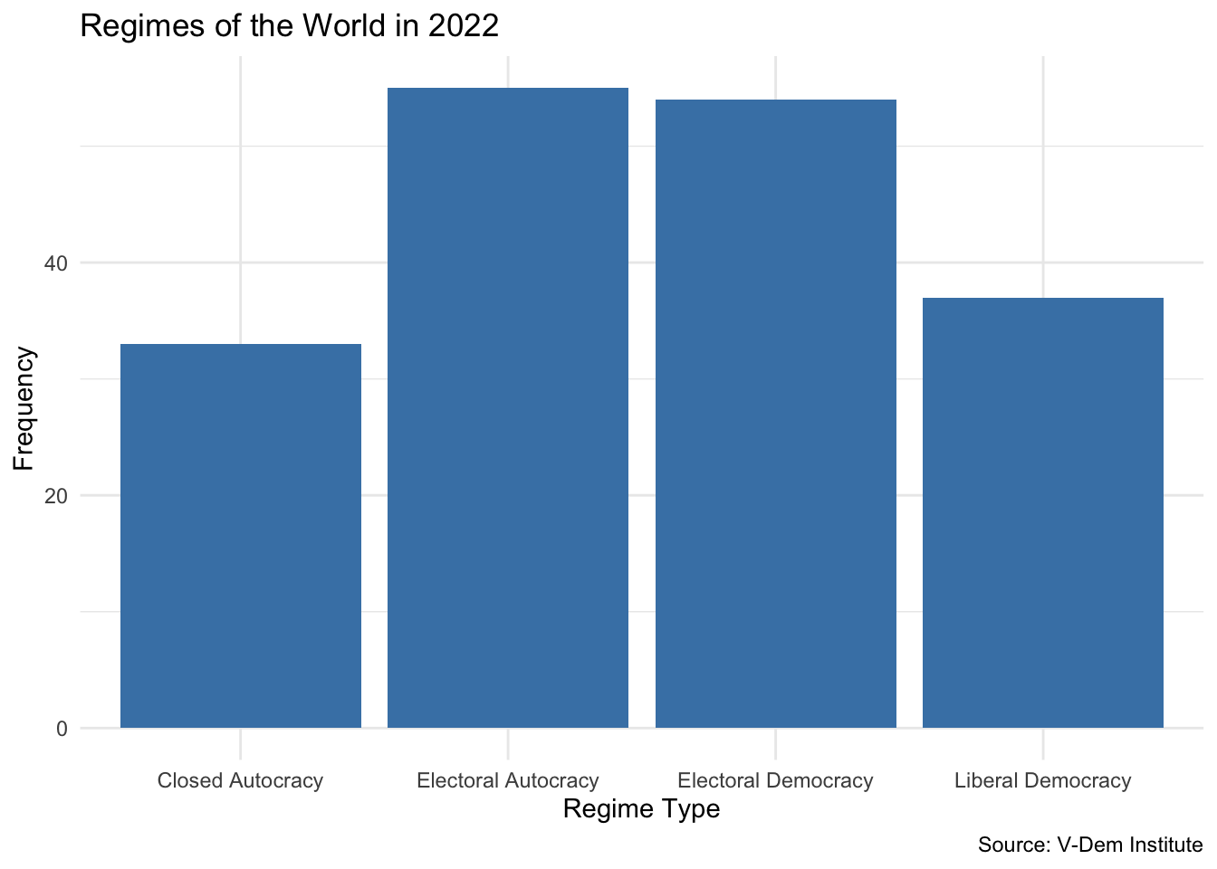
Let’s look at a real categorical variable: V-Dem’s Regimes of the World classification, which sorts countries into four types:
Closed Autocracy
Electoral Autocracy
Electoral Democracy
Liberal Democracy
These categories follow a meaningful order from least to most democratic, making this an ordinal categorical variable. We start by glimpsing the data:
               regime  n
1    Closed Autocracy 33
2 Electoral Autocracy 55
3 Electoral Democracy 54
4   Liberal Democracy 37
A bar chart gives us the same information visually. We use geom_bar(), which automatically counts observations for each category — you only need to specify the x aesthetic:
vdem2022|>ggplot(aes(x =regime))+geom_bar(fill ="steelblue")+labs( x ="Regime Type", y ="Frequency", title ="Regimes of the World in 2022", caption ="Source: V-Dem Institute")+theme_minimal()
Electoral democracies are the most common regime type in 2022, followed closely by electoral autocracies.
Note
geom_bar() and geom_col() both make bar charts, but they work differently. geom_bar() counts observations automatically — you only need to specify x. geom_col() requires you to supply both x and y, where y is a column of pre-computed values. Use geom_bar() when working directly with raw data; use geom_col() when you have already summarized the data yourself.
Your Turn
Filter the data to a different year and visualize the distribution of regime types.
Update the plot title to reflect the year you chose.
What differences do you notice compared to 2022?
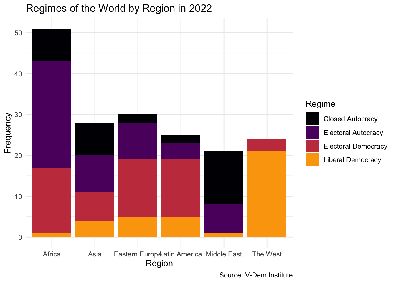
Regimes by Region
Now let’s break the distribution down by world region. We map region to the x-axis and use the fill aesthetic to color bars by regime type:
vdem2022|>ggplot(aes(x =region, fill =regime))+geom_bar()+theme_minimal()+labs( x ="Region", y ="Frequency", title ="Regimes of the World by Region in 2022", caption ="Source: V-Dem Institute", fill ="Regime")+scale_fill_viridis_d(option ="inferno", end =.8)
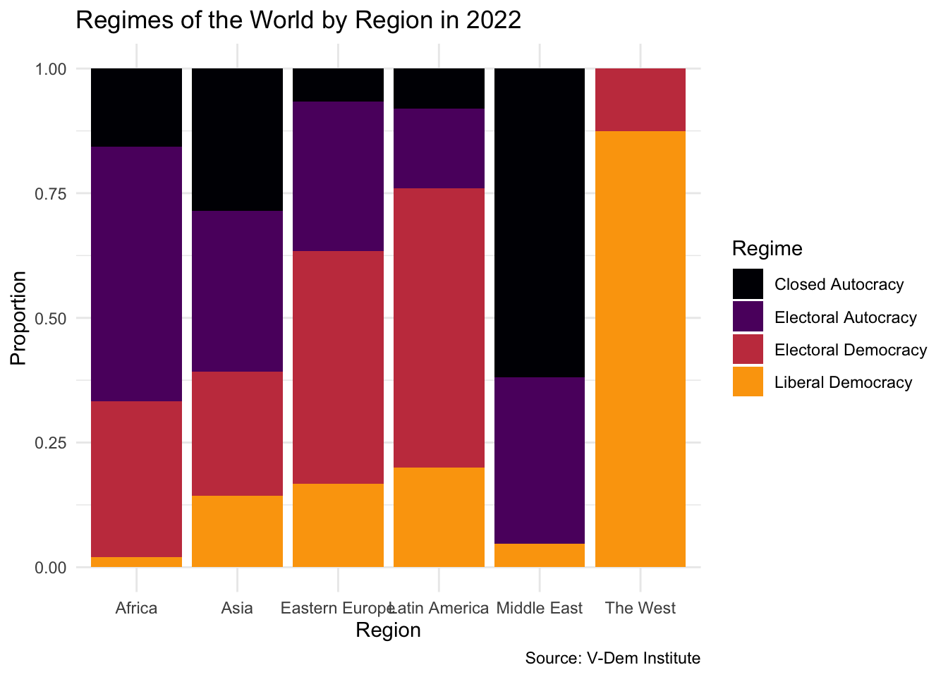
One challenge immediately appears: Africa has far more countries than Eastern Europe or the Middle East. Even if the proportions were identical, Africa’s bars would simply be taller. To make a fair comparison across regions, we can switch from counts to proportions using position = "fill":
vdem2022|>ggplot(aes(x =region, fill =regime))+geom_bar(position ="fill")+theme_minimal()+labs( x ="Region", y ="Proportion", title ="Regimes of the World by Region in 2022", caption ="Source: V-Dem Institute", fill ="Regime")+scale_fill_viridis_d(option ="inferno", end =.8)
Now we can compare across regions on equal footing. The West stands out for the prevalence of liberal democracies; the Middle East and Africa have the highest concentration of closed and electoral autocracies.
Note what kinds of variables we are combining here. Region is a nominal categorical variable — there is no meaningful order to Asia, Africa, or Latin America. Regime type is an ordinal categorical variable — its categories run from least to most democratic. Recognizing this distinction helps us think about how to display and interpret the data.
Your Turn
Switch the x-axis from region to regime and the fill to region. What does this version of the plot emphasize?
Try position = "dodge" instead of position = "fill". What are the trade-offs between the stacked proportional chart and the side-by-side chart?
Use filter() to restrict the plot to a single region. What do you find?