Describing Distributions

August 24, 2026

Measuring Spread

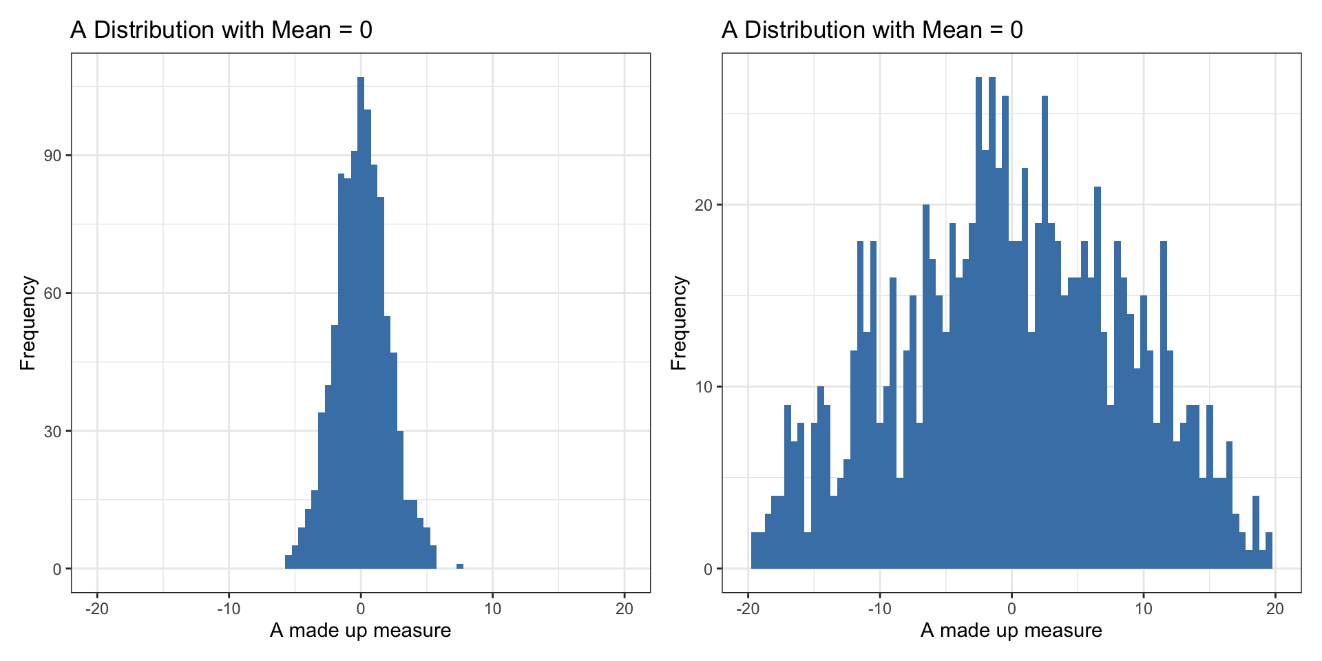
Why Measure and Visualize Spread?

IQR

What is a Range?


  • Range (min and max values)
  • Not ideal b/c does not tell us much about where most of the values are located
vdem2022 |>
  summarize(min = min(polyarchy),
            max = max(polyarchy))
    min   max
1 0.015 0.915

Interquartile Range

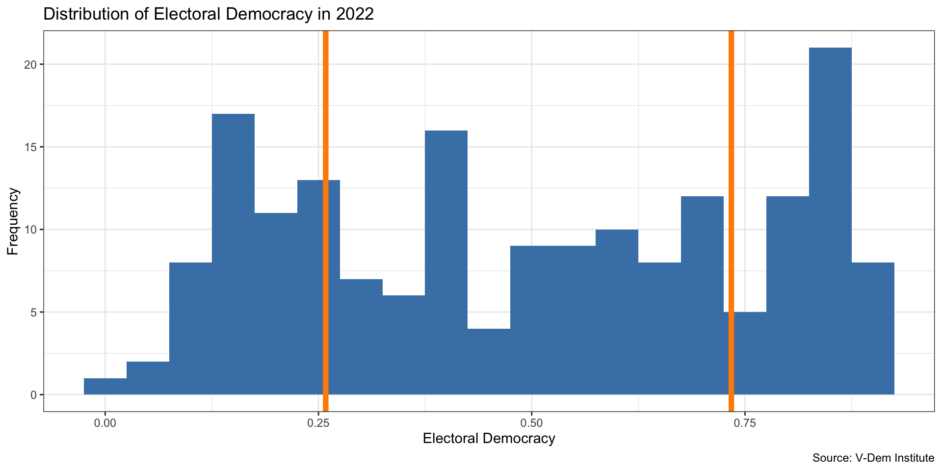
IQR: 25th percentile - 75th percentile
Interquartile Range

  • The middle 50 percent of the countries in the data lie between 0.262 and 0.747
  • The IQR (0.485) is the difference between the Q3 and Q1 values
vdem2022 %>% 
  summarize(IQRlow =  quantile(polyarchy, .25),
            IQRhigh = quantile(polyarchy, .75),
            IQRlength = IQR(polyarchy)
          )
  IQRlow IQRhigh IQRlength
1 0.2585   0.734    0.4755

Box Plot


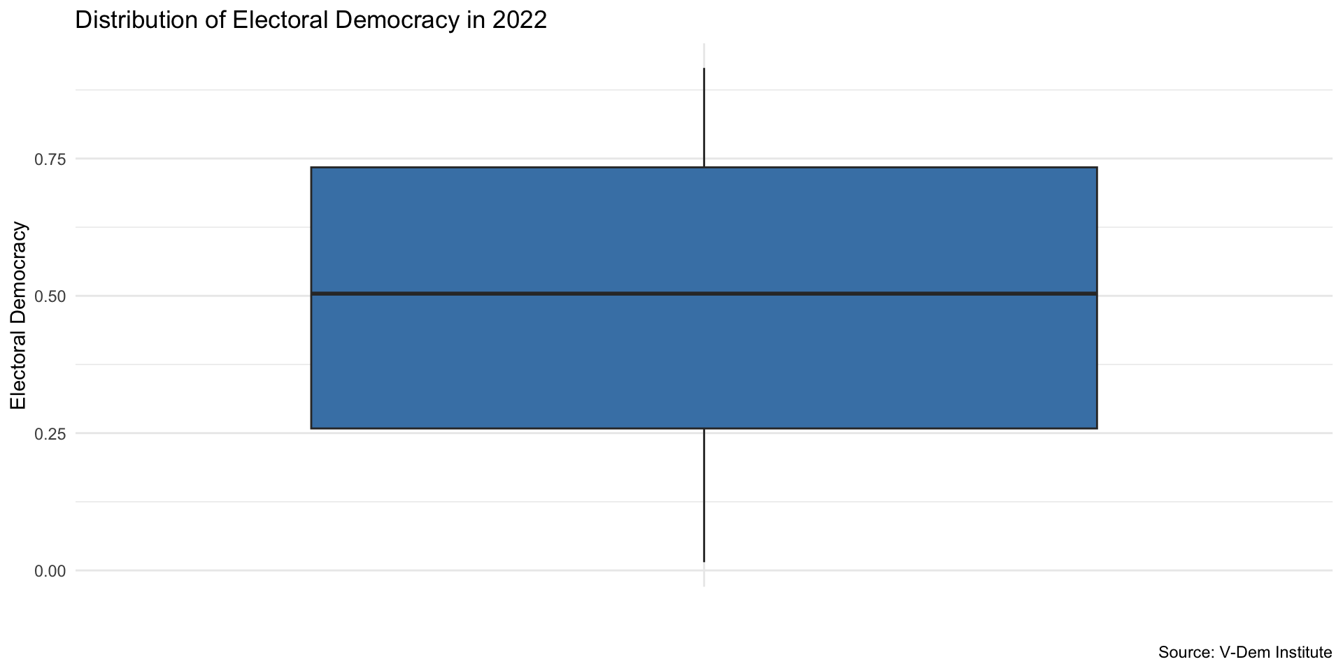
  • A box plot is a graphical representation of the distribution based on the median and quartiles
  • It is a standardized way of displaying the distribution of data based on a five number summary: minimum, first quartile, median, third quartile, and maximum

Box Plot

Code
ggplot(vdem2022, aes(x = "", y = polyarchy)) +
  geom_boxplot(fill = "steelblue") + 
   labs(
    x = "", 
    y = "Electoral Democracy", 
    title = "Distribution of Electoral Democracy in 2022", 
    caption = "Source: V-Dem Institute"
  ) +
  theme_minimal()

Standard Deviation

Measure of Spead: Standard Deviation


  • Can think of it as something like the “average distance” of each data point from the mean
vdem2022 |>
  summarize(mean = mean(polyarchy),
            stdDev = sd(polyarchy))
       mean   stdDev
1 0.4955978 0.262777

Standard Deviation


  • A low standard deviation indicates that the values tend to be close to the mean
  • A high standard deviation indicates that the values are spread out over a wider range

Starting with Variance


  • Variance is a step towards calculating the standard deviation.
  • It quantifies the average squared deviation of each number from the mean of the data set.

Calculating Deviation from the Mean

  • First, calculate the mean (\(\bar{X}\)) of the dataset.
  • For each data point (\(X_i\)), calculate its deviation from the mean: \[e_i = X_i - \bar{X}\]
    • Example with a mean of 5:
      • For a data point where \((X_i = 0): (0 - 5 = -5)\)
      • For a data point where \((X_i = 10): (10 - 5 = 5)\)

Squaring the Deviations

  • Squaring each deviation (\(e_i\)) to eliminate negative values: \[e_i^2 = (X_i - \bar{X})^2\]
  • Summing up all squared deviations: \[\sum_{i=1}^{n} (X_i - \bar{X})^2\]
  • This sum represents the total squared deviation from the mean.

Calculating the Variance


  • Divide the total squared deviation by \((n-1)\) (to account for the sample variance): \[\text{Variance} = \frac{1}{n-1} \sum_{i=1}^{n} (X_i - \bar{X})^2\]
  • Using \((n-1)\) ensures an unbiased estimate of the population variance when calculating from a sample.

Deriving the Standard Deviation


  • The standard deviation is the square root of the variance: \[s = \sqrt{\frac{1}{n-1} \sum_{i=1}^{n} (X_i - \bar{X})^2}\]
  • Taking the square root converts the variance back to the units of the original data.

Standard Deviation Simple Example


x = c(0, 1, 2, 3, 4, 5, 6, 7, 8, 9, 10)
e <- x - mean(x)
e
 [1] -5 -4 -3 -2 -1  0  1  2  3  4  5

Standard Deviation Simple Example


x = c(0, 1, 2, 3, 4, 5, 6, 7, 8, 9, 10)
e_squared <- e^2
e_squared
 [1] 25 16  9  4  1  0  1  4  9 16 25

Standard Deviation Simple Example


x = c(0, 1, 2, 3, 4, 5, 6, 7, 8, 9, 10)
sum_e_squared <- sum(e_squared)
sum_e_squared
[1] 110

Standard Deviation Simple Example


variance <- sum_e_squared/(length(x)-1)
variance
[1] 11

Standard Deviation Simple Example


standard_dev <- sqrt(variance)
standard_dev
[1] 3.316625
sd(x)
[1] 3.316625

Your Turn!


  • Calculate measures of spread for the polyarchy variable in the V-Dem data (mean, median, IQR, standard deviation)
  • How would you interpret these measures?
  • Try a box plot for the polyarchy variable
  • Try another variable in the V-Dem data
  • How does it compare to polyarchy?

Groups

Calculating Statistics by groups


  • What if we want to describe electoral democracy and see how it differs by some different variable? For example, by world region, or by year?
  • In this case we want to combine numerical summaries with categorical variables
  • This brings us back to bar chart

Calculating Statistics by Groups

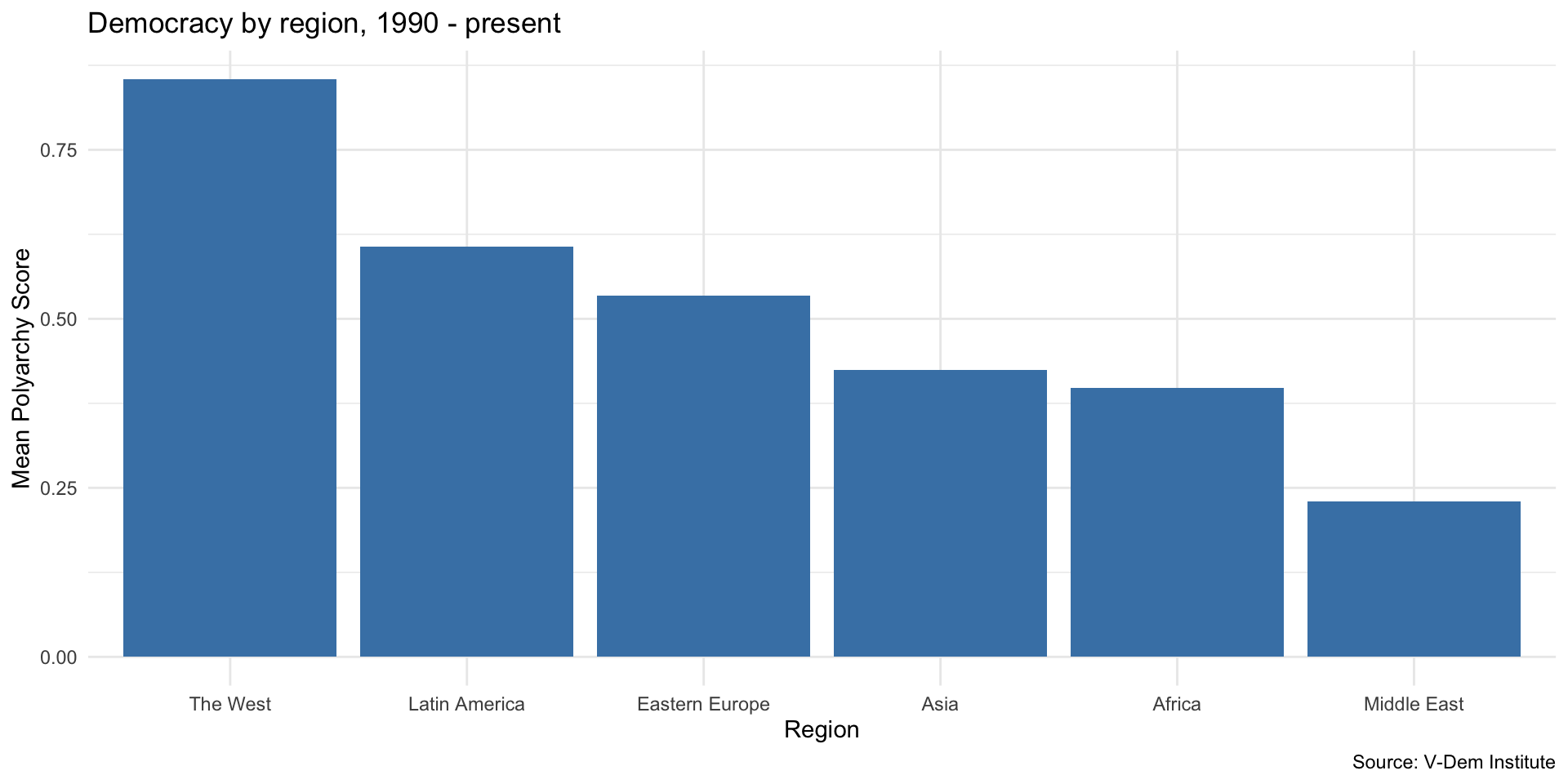
  • Let’s calculate the mean and median of electoral democracy in each world region
  • For this, we add the group_by() to our previous code
vdem2022 |>
  group_by(region) |>
  summarize(mean_dem = mean(polyarchy),
            median_dem = median(polyarchy))
# A tibble: 6 × 3
  region         mean_dem median_dem
  <chr>             <dbl>      <dbl>
1 Africa            0.398      0.377
2 Asia              0.425      0.404
3 Eastern Europe    0.534      0.566
4 Latin America     0.606      0.692
5 Middle East       0.229      0.206
6 The West          0.854      0.853

Calculating Statistics by Groups

  • Let’s store our statistics as a new data object, democracy_region
democracy_region <- vdem2022 |> 
  group_by(region) |>
  summarize(mean_dem = mean(polyarchy),
            median_dem = median(polyarchy))

democracy_region
# A tibble: 6 × 3
  region         mean_dem median_dem
  <chr>             <dbl>      <dbl>
1 Africa            0.398      0.377
2 Asia              0.425      0.404
3 Eastern Europe    0.534      0.566
4 Latin America     0.606      0.692
5 Middle East       0.229      0.206
6 The West          0.854      0.853

Visualize using our Bar Chart Skills

Code
ggplot(democracy_region, aes(x = reorder(region, -mean_dem), y = mean_dem)) +
  geom_col(fill = "steelblue") + 
  labs(
    x = "Region", 
    y = "Mean Polyarchy Score", 
    title = "Democracy by region, 1990 - present", 
    caption = "Source: V-Dem Institute"
    ) + 
  theme_minimal()

Numerical Variable by Group

How should we interpret this plot?
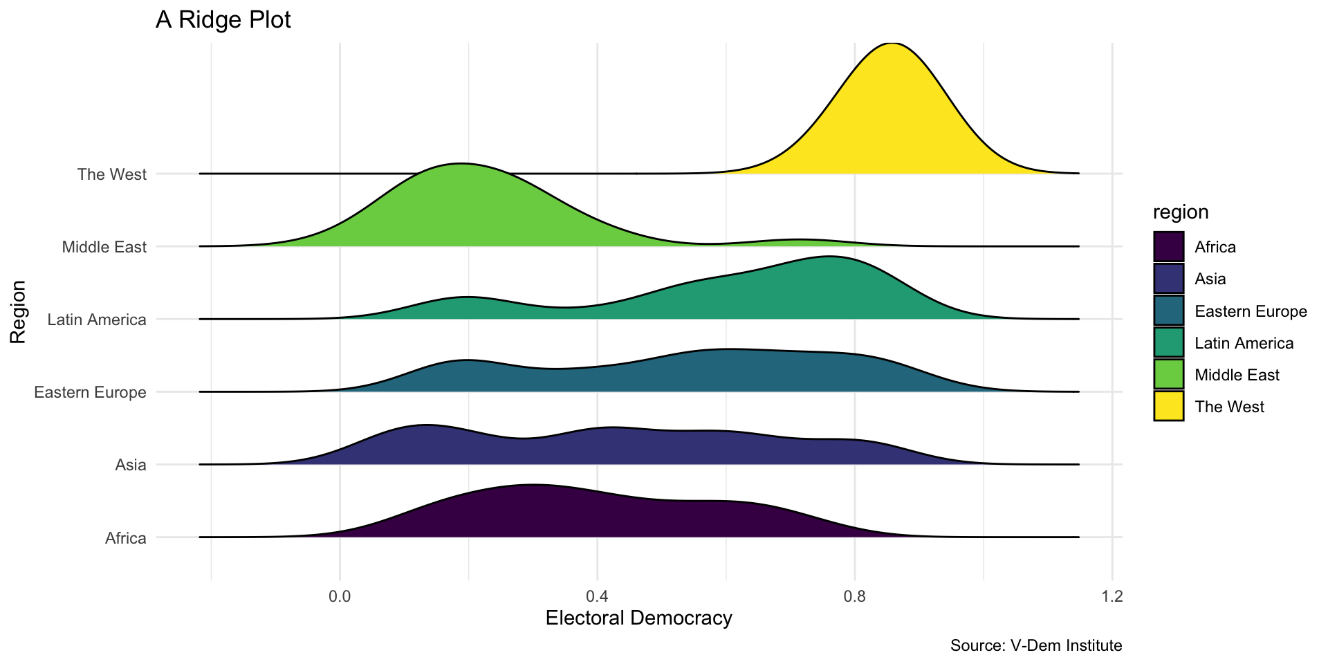
Code
library(ggridges)
#library(forcats)
  ggplot(vdem2022, aes(x = polyarchy, y = region, fill = region)) +
    geom_density_ridges() +
  labs(
    x = "Electoral Democracy",
    y = "Region",
    title = "A Ridge Plot",
    caption = "Source: V-Dem Institute",
  ) +
  scale_fill_viridis_d() +
  theme_minimal()

Your Turn!


  • Make a bar chart summarizing polyarchy or some other V-Dem variable
  • Now try your hand at a ridge plot