Line Charts & Scatter Plots
September 21, 2026
Huntington’s Three Waves
Line Chart
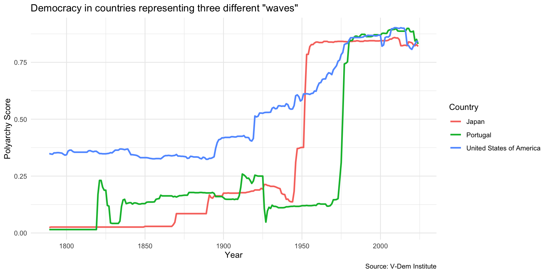
Here is the code…
# in this ggplot() call, we add a third dimension for line color
ggplot(dem_waves_ctrs, aes(x = year, y = polyarchy, color = country)) +
  geom_line(linewidth = 1) + # our geom is a line with a width of 1
  labs(
    x = "Year",
    y = "Polyarchy Score",
    title = 'Democracy in countries representing three different "waves"',
    caption = "Source: V-Dem Institute",
    color = "Country" # make title of legend to upper case
  )
Use geom_line() to specify a line chart…
# in this ggplot() call, we add a third dimension for line color
ggplot(dem_waves_ctrs, aes(x = year, y = polyarchy, color = country)) +
  geom_line(linewidth = 1) + # our geom is a line with a width of 1
  labs(
    x = "Year",
    y = "Polyarchy Score",
    title = 'Democracy in countries representing three different "waves"',
    caption = "Source: V-Dem Institute",
    color = "Country" # make title of legend to upper case
  )
Add third dimension to the aes() call for line color…
# in this ggplot() call, we add a third dimension for line color
ggplot(dem_waves_ctrs, aes(x = year, y = polyarchy, color = country)) +
  geom_line(linewidth = 1) + # our geom is a line with a width of 1
  labs(
    x = "Year",
    y = "Polyarchy Score",
    title = 'Democracy in countries representing three different "waves"',
    caption = "Source: V-Dem Institute",
    color = "Country" # make title of legend to upper case
  )
Modify the legend title…
# in this ggplot() call, we add a third dimension for line color
ggplot(dem_waves_ctrs, aes(x = year, y = polyarchy, color = country)) +
  geom_line(linewidth = 1) + # our geom is a line with a width of 1
  labs(
    x = "Year",
    y = "Polyarchy Score",
    title = 'Democracy in countries representing three different "waves"',
    caption = "Source: V-Dem Institute",
    color = "Country" # make title of legend to upper case
  )
Use a colorblind safe color scheme like viridis…
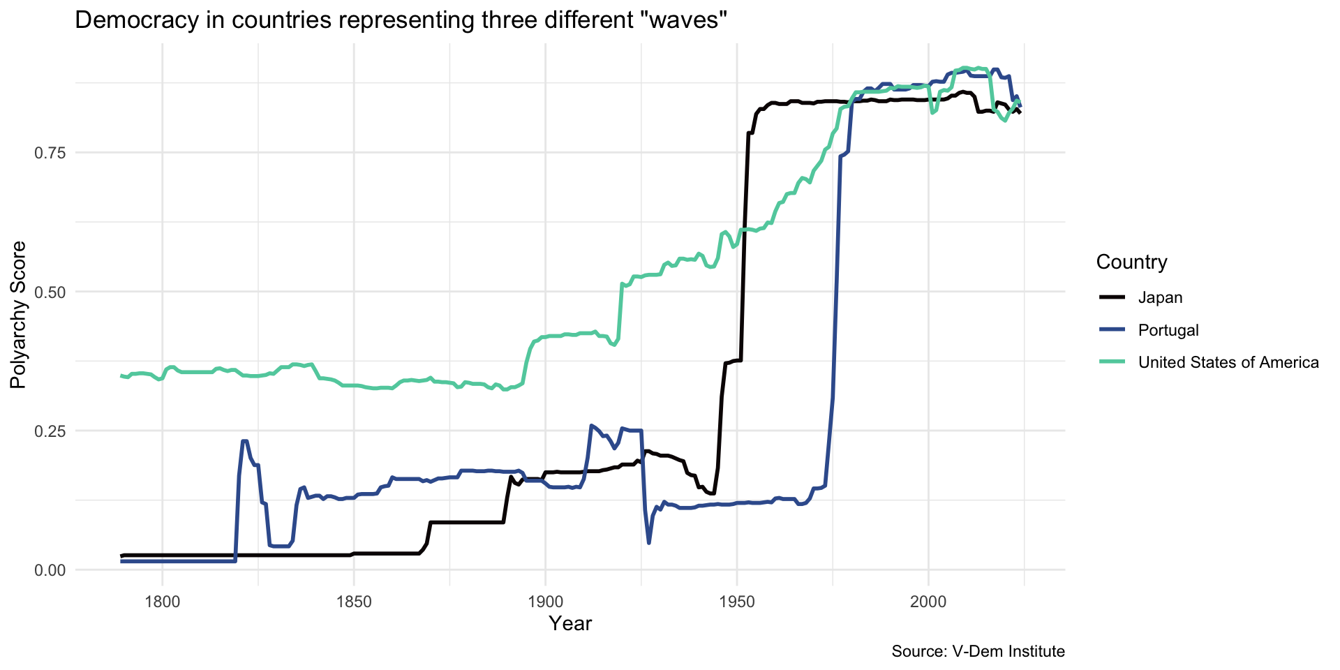
Here scale_color_viridis_d() specifies the viridis color scheme…
# in this ggplot() call, we add a third dimension for line color
ggplot(dem_waves_ctrs, aes(x = year, y = polyarchy, color = country)) +
  geom_line(linewidth = 1) + # our geom is a line with a width of 1
  labs(
    x = "Year",
    y = "Polyarchy Score",
    title = 'Democracy in countries representing three different "waves"',
    caption = "Source: V-Dem Institute",
    color = "Country" # make title of legend to upper case
  ) +
  scale_color_viridis_d(option = "mako", end = .8) # use viridis color palette
Palettes
- There are a number of viridis palettes
- See this reference to view different palettes and options
- You can also use
scale_color_viridis_c()to specify a continuous color scale - Also check out the paletteer package for easy access to many more palettes
Your Turn!
- See table three of this article
- Select three countries to visualize
- Adjust setup code to filter data on those countries
- Visualize with
geom_line() - Use
scale_color_viridis_d()to specify a viridis color scheme
Scatter Plot
Scatter Plot
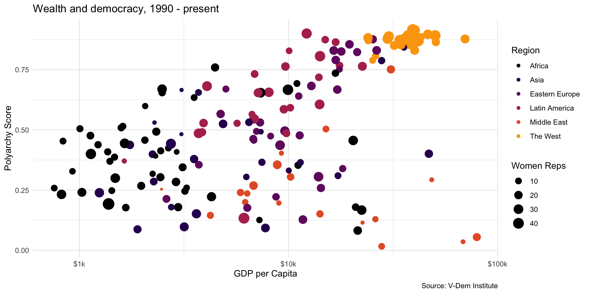
Use geom_point()…
ggplot(dem_summary_ctry, aes(x = gdp_pc, y = polyarchy, color = region, size = women_rep)) +
  geom_point() + # use geom_point() for scatter plots
  scale_x_log10(labels = scales::label_number(prefix = "$", suffix = "k")) +
  labs(
    x= "GDP per Capita",
    y = "Polyarchy Score",
    title = "Wealth and democracy, 1990 - present",
    caption = "Source: V-Dem Institute",
    color = "Region",
    size = "Women Reps"
    ) +
  scale_color_viridis_d(option = "inferno", end = .8)
Scatter Plot
Four dimensions…
ggplot(dem_summary_ctry, aes(x = gdp_pc, y = polyarchy, color = region, size = women_rep)) +
  geom_point() + # use geom_point() for scatter plots
  scale_x_log10(labels = scales::label_number(prefix = "$", suffix = "k")) +
  labs(
    x= "GDP per Capita",
    y = "Polyarchy Score",
    title = "Wealth and democracy, 1990 - present",
    caption = "Source: V-Dem Institute",
    color = "Region",
    size = "Women Reps"
    ) +
  scale_color_viridis_d(option = "inferno", end = .8)
Scatter Plot
Stretch axis on log scale and use scales package to adjust labels…
ggplot(dem_summary_ctry, aes(x = gdp_pc, y = polyarchy, color = region, size = women_rep)) +
  geom_point() + # use geom_point() for scatter plots
  scale_x_log10(labels = scales::label_number(prefix = "$", suffix = "k")) +
  labs(
    x= "GDP per Capita",
    y = "Polyarchy Score",
    title = "Wealth and democracy, 1990 - present",
    caption = "Source: V-Dem Institute",
    color = "Region",
    size = "Women Reps"
    ) +
  scale_color_viridis_d(option = "inferno", end = .8)
Scatter Plot
Change legend titles…
ggplot(dem_summary_ctry, aes(x = gdp_pc, y = polyarchy, color = region, size = women_rep)) +
  geom_point() + # use geom_point() for scatter plots
  scale_x_log10(labels = scales::label_number(prefix = "$", suffix = "k")) +
  labs(
    x= "GDP per Capita",
    y = "Polyarchy Score",
    title = "Wealth and democracy, 1990 - present",
    caption = "Source: V-Dem Institute",
    color = "Region",
    size = "Women Reps"
    ) +
  scale_color_viridis_d(option = "inferno", end = .8)
Your Turn!
- There are four variables in
dem_summary_ctry - Pick one related to women’s empowerment
- Visualize it on the y-axis with
gdp_pcorpolyarchyon the x-axis - Change labels and legend titles to match your visualization
- Interpret your plot
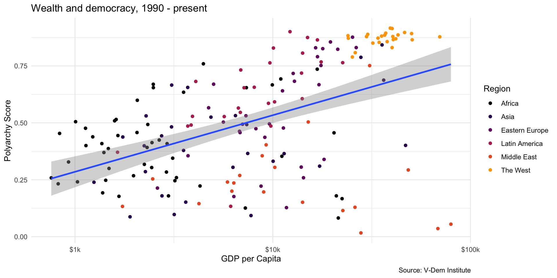
Add a Trend Line
Add a Trend Line
ggplot(dem_summary_ctry, aes(x = gdp_pc, y = polyarchy)) +
  geom_point(aes(color = region)) +
  geom_smooth(method = "lm", linewidth = 1) +
  scale_x_log10(labels = scales::label_number(prefix = "$", suffix = "k")) +
  labs(
    x= "GDP per Capita",
    y = "Polyarchy Score",
    title = "Wealth and democracy, 1990 - present",
    caption = "Source: V-Dem Institute",
    color = "Region"
    ) +
  scale_color_viridis_d(option = "inferno", end = .8)
Add a Trend Line
Taking out size and adding color to geom_point() call…
ggplot(dem_summary_ctry, aes(x = gdp_pc, y = polyarchy)) +
  geom_point(aes(color = region)) +
  geom_smooth(method = "lm", linewidth = 1) +
  scale_x_log10(labels = scales::label_number(prefix = "$", suffix = "k")) +
  labs(
    x= "GDP per Capita",
    y = "Polyarchy Score",
    title = "Wealth and democracy, 1990 - present",
    caption = "Source: V-Dem Institute",
    color = "Region"
    ) +
  scale_color_viridis_d(option = "inferno", end = .8)
Add a Trend Line
Changing legend titles…
ggplot(dem_summary_ctry, aes(x = gdp_pc, y = polyarchy)) +
  geom_point(aes(color = region)) +
  geom_smooth(method = "lm", linewidth = 1) +
  scale_x_log10(labels = scales::label_number(prefix = "$", suffix = "k")) +
  labs(
    x= "GDP per Capita",
    y = "Polyarchy Score",
    title = "Wealth and democracy, 1990 - present",
    caption = "Source: V-Dem Institute",
    color = "Region"
    ) +
  scale_color_viridis_d(option = "inferno", end = .8)
Your Turn!
- Add a trendline to your plot
- Change the labels accordingly
- Try using
method = "loess"instead of a “lm”
Facet Wrapping
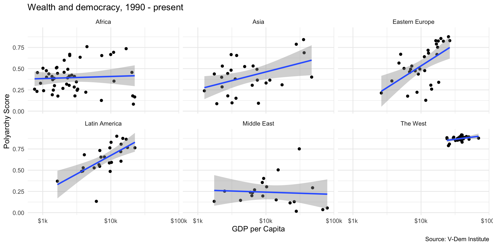
Facet Wrapping
Use facet_wrap() with ~ before variable you want to wrap on…
ggplot(dem_summary_ctry, aes(x = gdp_pc, y = polyarchy)) +
  geom_point() +
  geom_smooth(method = "lm", linewidth = 1) +
  facet_wrap(~ region) +
  scale_x_log10(labels = scales::label_number(prefix = "$", suffix = "k")) +
  labs(
    x= "GDP per Capita",
    y = "Polyarchy Score",
    title = "Wealth and democracy, 1990 - present",
    caption = "Source: V-Dem Institute"
    )
Facet Wrapping
What else changes? Back down to two dimensions…
ggplot(dem_summary_ctry, aes(x = gdp_pc, y = polyarchy)) +
  geom_point() +
  geom_smooth(method = "lm", linewidth = 1) +
  facet_wrap(~ region) +
  scale_x_log10(labels = scales::label_number(prefix = "$", suffix = "k")) +
  labs(
    x= "GDP per Capita",
    y = "Polyarchy Score",
    title = "Wealth and democracy, 1990 - present",
    caption = "Source: V-Dem Institute"
    )
Facet Wrapping
Don’t forget to take the legend title out of the captions…
ggplot(dem_summary_ctry, aes(x = gdp_pc, y = polyarchy)) +
  geom_point() +
  geom_smooth(method = "lm", linewidth = 1) +
  facet_wrap(~ region) +
  scale_x_log10(labels = scales::label_number(prefix = "$", suffix = "k")) +
  labs(
    x= "GDP per Capita",
    y = "Polyarchy Score",
    title = "Wealth and democracy, 1990 - present",
    caption = "Source: V-Dem Institute"
    )
Your Turn!
- Facet wrap your scatter plot
- Use
scales = "free"infacet_wrapcall to fix the Westfacet_wrap(~ region, scales = "free")
Labeling Points
Labeling Points
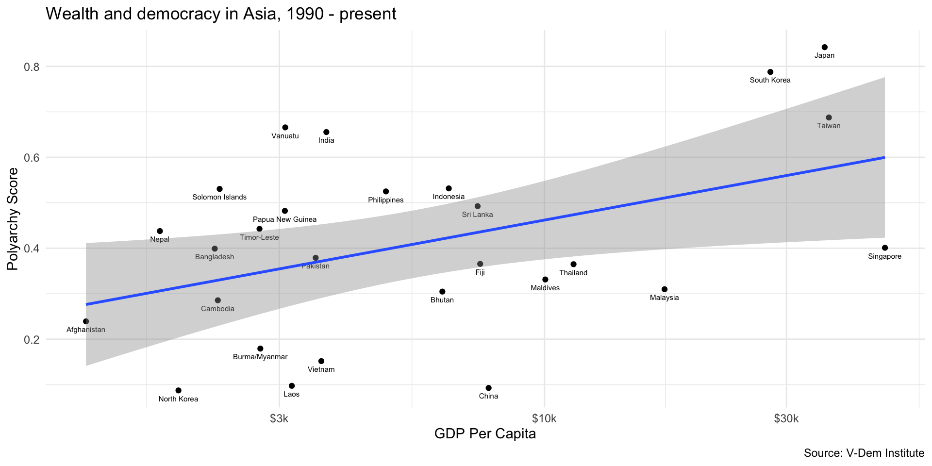
Filter for Asia, add labels with geom_text()…
dem_summary_ctry |>
  filter(region == "Asia") |>
  ggplot(aes(x = gdp_pc, y = polyarchy)) +
    geom_point() +
    geom_text(aes(label = country), size = 2, vjust = 2) +
    geom_smooth(method = "lm", linewidth = 1) +
    scale_x_log10(labels = scales::label_number(prefix = "$", suffix = "k")) +
      labs(
        x= "GDP Per Capita",
        y = "Polyarchy Score",
        title = "Wealth and democracy in Asia, 1990 - present",
        caption = "Source: V-Dem Institute"
        )
Your Turn!
- Filter for Asia or another region
- Use
geom_text()to add labels to your points - Play with
sizeandvjustparamters
Make it Interactive
Use plotly to make any plot interactive…
library(plotly)

modernization_plot <- ggplot(dem_summary_ctry, aes(x = gdp_pc, y = polyarchy)) +
  geom_point(aes(color = region)) +
  aes(label = country) +
  geom_smooth(method = "lm", linewidth = 1) +
  scale_x_log10(labels = scales::label_number(prefix = "$", suffix = "k")) +
  labs(
    x= "GDP per Capita",
    y = "Polyarchy Score",
    title = "Wealth and democracy, 1990 - present",
    caption = "Source: V-Dem Institute",
    color = "Region"
    ) +
  scale_color_viridis_d(option = "inferno", end = .8)

ggplotly(modernization_plot, tooltip = c("country", "gdp_pc", "polyarchy"))